Lazy Suzan
Lazy Suzan is a hands free mobile cooking application prototype built for a class project at Iowa State University. The goal of the project was to explore every phase of the UX process from requirements gathering, to design and evaluation.

Problem Statement
Using online recipes often involves scrolling through extraneous content and ads to get to the instructions. These can be difficult to read on small screens and hard to navigate when hands are dirty or occupied during the cooking process. My team sought to create a mobile prototype application to solve these problems.
Interviews
The requirements gathering phase of this project involved interviewing home cooks to better understand their cooking methods and their mobile app needs. We purposefully did not limit our inquiry to the use of electronic devices in the kitchen, in order to gain a contextual understanding of the work flow and pain points. After the interviews were completed, the data was sorted into a qualitative theme analysis. This analysis helped us break down the problem into more meaningful chunks of information.
Task Analysis
An ethnographic study of one user was conducted to gain contextual understanding of the cooking process and help form design requirements. For the ethnographic study, the user was given a recipe to follow, and then observed as they cooked in their own home kitchen with their own cookware and tools. During the study the user was encouraged to think aloud and asked questions about their process. A hierarchical task analysis of the cooking process was then created based on the information recorded.
Task analysis diagram
Personas
Before starting the disign process, we decided to create two personas which became evident from the data we collected: "the Planner" and "the Improviser." The planner is interested in healthy meal planning, shopping ahead of time with recipes in mind, and doesn't have time to search through complicated recipes or websites with lots of distractions. She is our primary persona. Contrastingly, the improviser is typically found throwing together whatever is left over in the fridge, because leads a relatively hectic life and cares less about the food he eats. he would like to try new recipes, but he only gets around to it occasionally because of his busy life style.
Design & Implementation
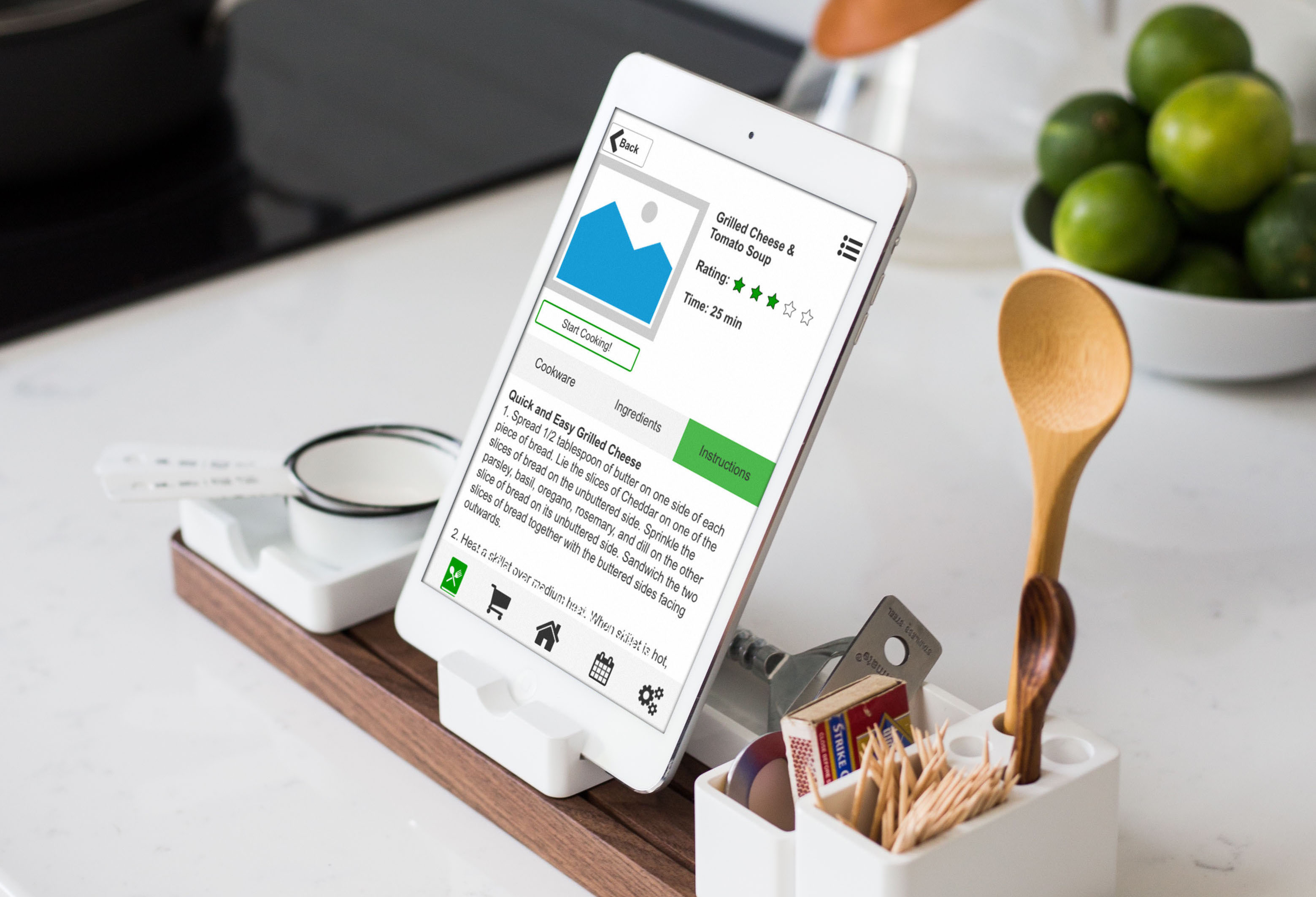
Based on our personas, we quickly realized that not only did the app need to have a simple hands-free solution to following recipes, it also needed features to help categorize and plan these recipes. Time management was also imperative. These ideas led to detailed sketches of the app. Then, a cognitive walk-through was conducted using a scenario and the set of hand-drawn wire frames to identify interaction issues. After most of the bugs were worked out, the wire frames were made into a working prototype using Axure RP. The entire app was functional in Axure, with the exception of voice commands, which were simulated using a "wizard of Oz" technique during testing.

Lazy Suzan Mockup
Usability Testing
The objective of this experiment was to examine the usability of the Lazy Suzan application when compared to allrecipes.com. The participants mainly consisted of young adults who cook using electronic recipes. A total of five participants served in the study (1 male, 4 female), with an average age of 28.57 (range: 17 - 50). Users were instructed to complete a mock cooking task using two recipes, once on allrecipes.com and once using the Lazy Suzan prototype. Users were observed completing the task in their own kitchen, and were encouraged to use props and think out loud whenever possible. After the task was completed with each app, a questionnaire including NASA TLX and SUS was completed.
Results
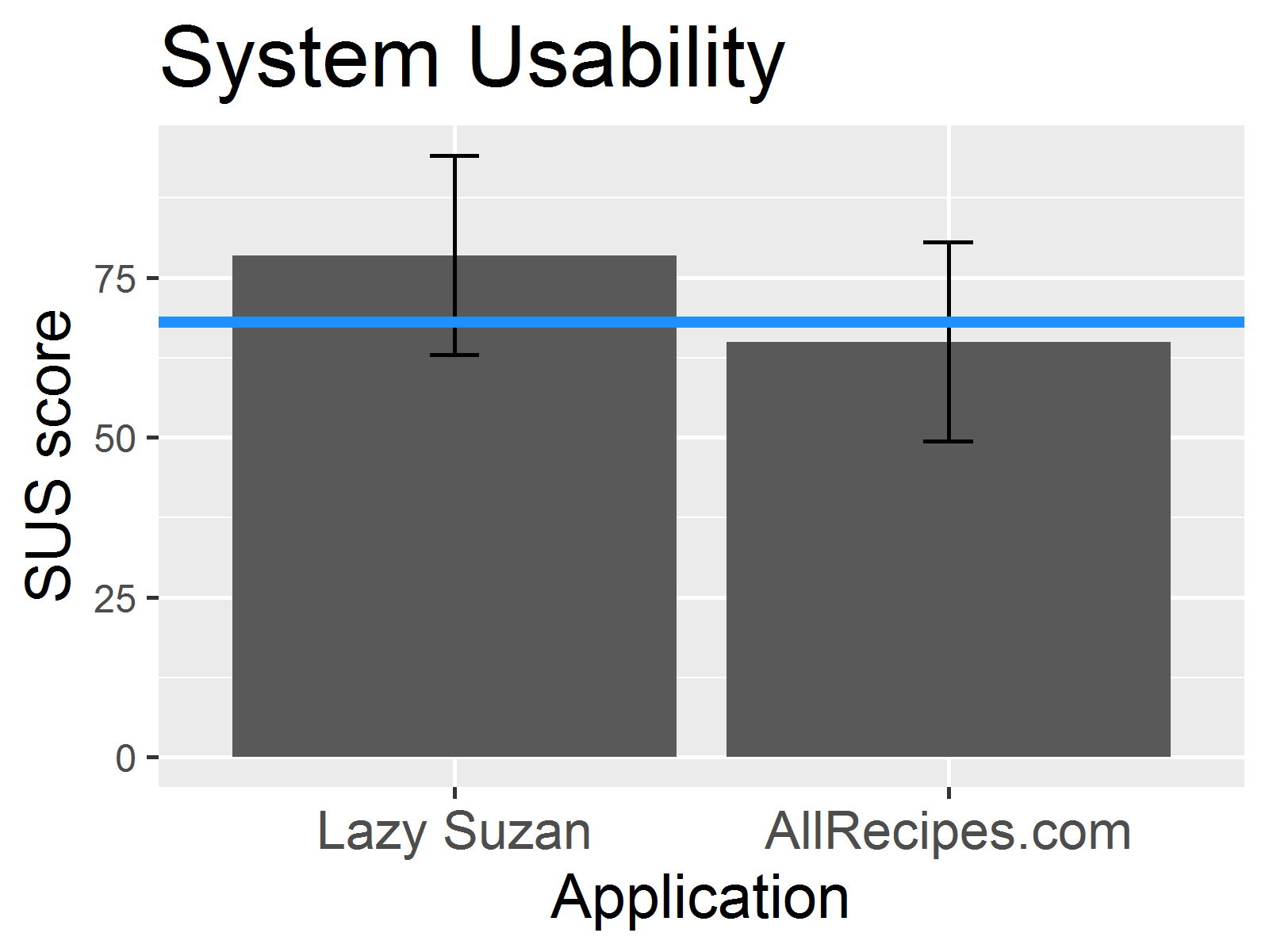
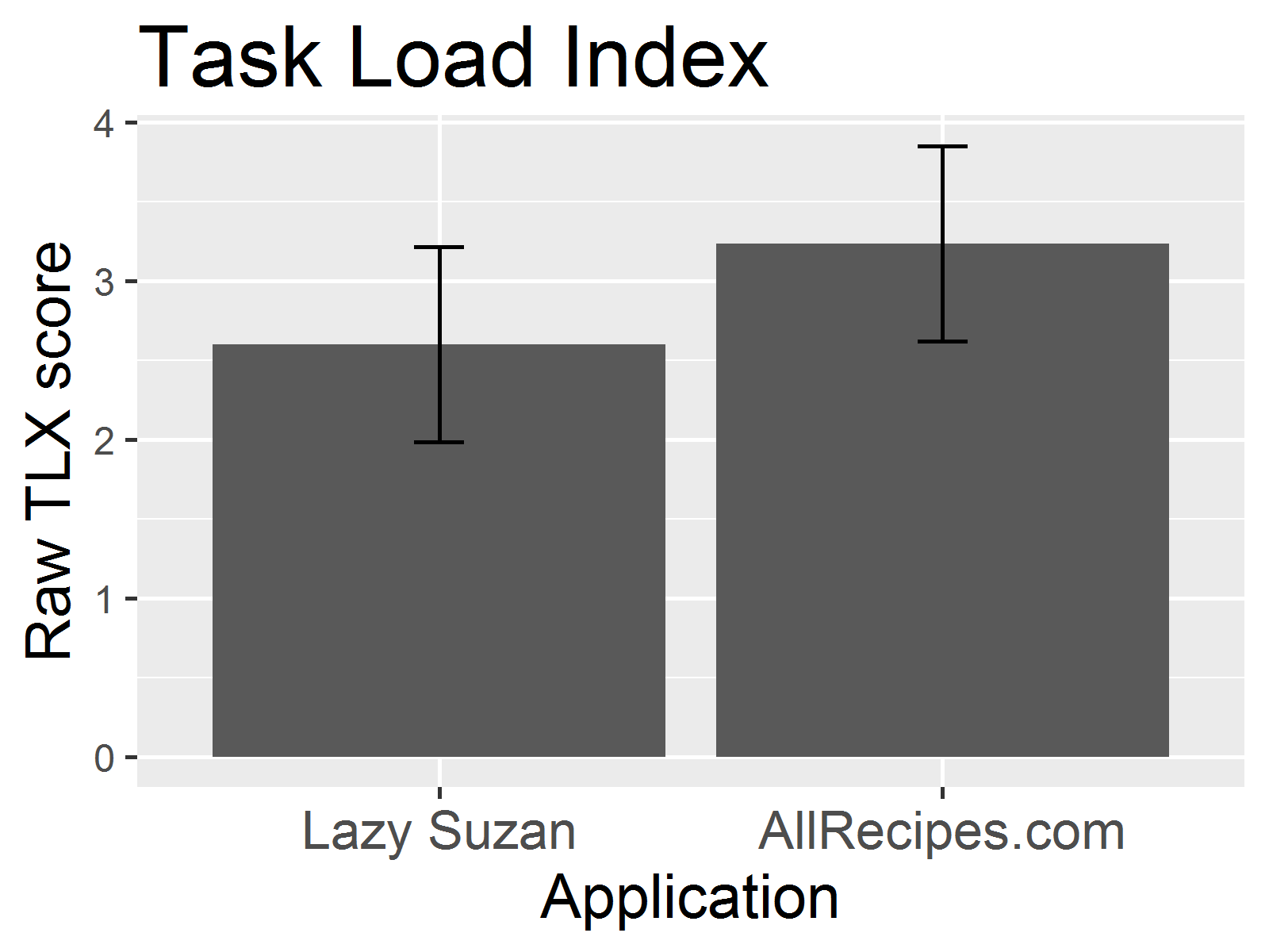
Because of the small sample size, no statistically significant conclusions could be drawn. However, the trends showed that Lazy Suzan had a higher mean SUS score, a lower NASA TLX, and a higher Ease of use rating than allrecipes.com. From this we concluded that our prototype application was more usable and less stressful than the alternative. In discussion, users mentioned that they liked the timers and the idea of a hands free, voice activated system. They also notice small bugs in the app that could be changed in future iterations, such as a scrolling error on longer recipe steps.


Lessons Learned
During this project I worked with an interdisciplinary team of student designers and researchers. Working with teammates of different skill sets helped me hone my own skills in communication. I also learned how to make interactive prototypes in Axure RP.